UNDERSTANDING VALUE for the BEGINNER
10/4/2017 8:26:01 PMWhat is value? In art, “value” means the lightness or darkness of a color or hue. “Tone” is another word for value. Value in a painting, defines form and creates the visual illusion of space.
Value is more important than color. In representational art, design strength comes from good value pattern, not color. Color is jewelry for the eye and alone cannot hold a painting together. For this reason, value is more important than color. Students should focus on mastering value in their work before placing a great amount of energy on color. Please note that you will find some value scales number white as 10 and others that list white as number 0 or 1.

The value scale is divided between white and black with light, mid-tone and dark values.
Nature throws thousands of values at us. Artist’s pigments are limited and only have a range of nine values including white and black. For this reason, it is not possible to replicate nature in painting. Instead, we use illusion through value to imply the landscape.
Contrast in values are essential in creating a successful painting. The human eye is drawn to shapes where light vs. dark is strongly contrasted. For this reason, the strongest versions of light and dark are placed in the focus area of a painting vs. the less important secondary areas of interest which should display less contrast. Emblaze the word contrast on your forehead. Contrast should be a constant companion to the artist on many levels.
Value gradation from light to dark or vice-a-versa, can give the illusion of a transition in space, distance, atmosphere, volume and visually makes objects appear curved or rounded.
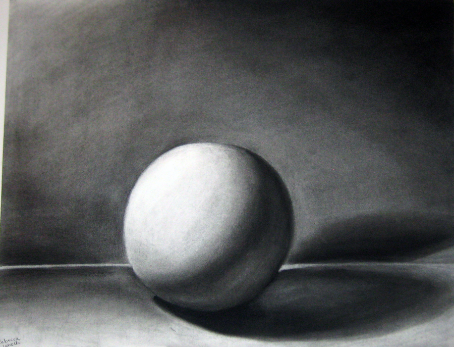
This is an important tool in drawing where the artist relies on black and white transitions to tell the viewer’s eye what it is seeing. Drawing tools include pencils that are numbered to help artists create value patterns. Only light lines are possible with the “H” or hard tempered pencils. Care must be given to not use too much hand pressure as these hard leads can indent paper and make further work difficult. The “B’s” imply black and are of a softer temper. The higher the number the softer the temper becomes. Therefore, a 2B is approximately equal to an office pencil and the 8B is extremely soft allowing for very dark graded passages. Note the gradations and various patterns in the illustration above using these pencils to indicate the lightness or darkness of subject values.

